Concept Art 101 - The HOW

THE HOW
(ominous titles are a great way to start huh?)
As I mentioned in last week’s blog, over the course of the project so far, we’ve released several time-lapse videos showing off the creation of some of our concept art images. Whilst they offer some insight into the process, they don’t show the whole picture (no pun intended), in part because they’re a couple of hours of drawing sped up into 30 seconds, but also because more has happened to create the image that you don’t see in the video. So lets try and fix that and go into a bit more detail about the steps I take.
1. Reference. Is. King.
No matter what you’re drawing, even if you think you know how to drawer it, your final image will be better for taking the time to find some reference. This can be a google image search, photos taken by yourself, or even just looking out of the window - whatever the form, just do it. I promise it will make a difference. Often for the time lapse images, I’ll have a whole bunch of photos and images open on my other monitor that I can refer to during my drawing.
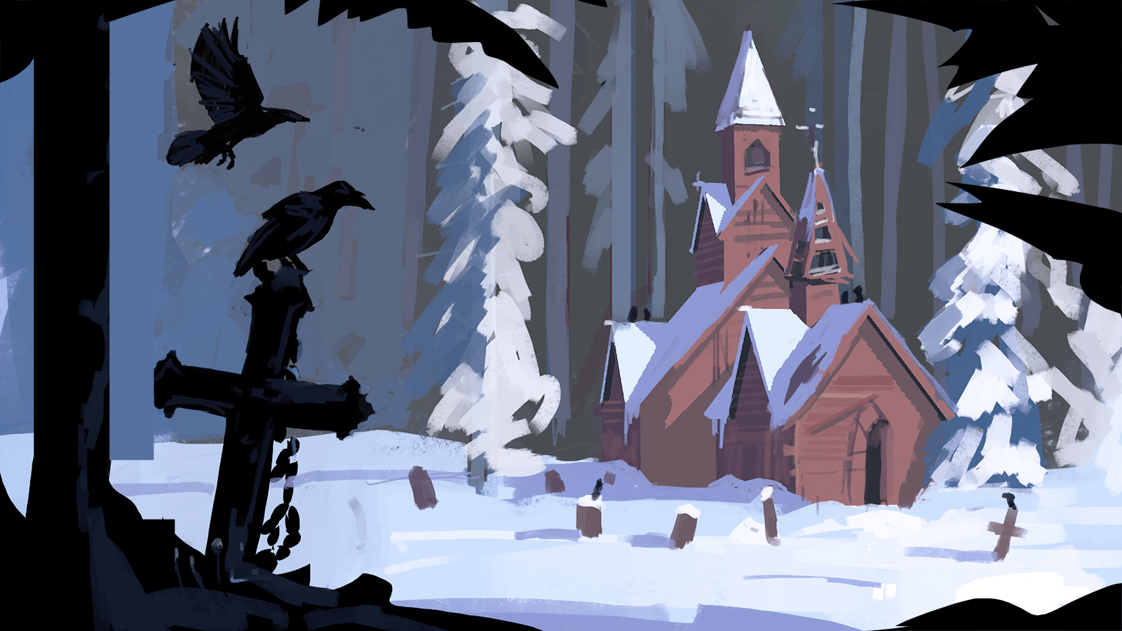
2. Composition
This needs to be the first element of the drawing to get resolved. What is the focus of the image, and how is it best framed. I’ll often do several thumbnail sketches to explore different options and find the right layout. I work of 3 general rules;
- The rule of thirds. If you divide an image into 3 vertically and 3 horizontally, the intersection points are the areas the eye is naturally drawn to. Placing an object of interest on 1 or 2 of these points is normally essential for a strong composition, unless your deliberately breaking the rule for a different effect, but that’s a whole different kettle of fish.
- Generally I like to use some foreground elements to help with depth and framing. Often then can stop the eyes escaping at the edge of the page and help force the view back into the image.
- Big. Medium. Small. Images tend to look good if you push visual elements into these size categories (you need all 3 for it to work). They can take the form of an actual thing like a mountain, but they can also be an area of nothingness, like a clear sky. Repeating shapes within these size groups also works very well. The human eye likes repetition!

Here the church sits nicely on the right hand 3rd, whereas the raven and cross sit inside the left 3rd, allowing the view to move across the image. They also keep the eye moving around the picture, essentially trapping the viewer's interest into the image.
3. Palette.
This can either be made up, or taken directly from reference. The important things is to find a harmonious colour palette. This means that the colours in the image not only work well together, but also help convey a mood. I often use the Adobe Colour Wheel to work out a palette before starting work on a image, then stick to these colours (or slight hue shifts of them) throughout the concept. I’ll also tend to do a rough colour pass on my chosen composition sketch just to make sure I’m happy with the direction I’m taking before spending time working it up.
Church Rough Sketch.
4. Flip it up.
Flipping your image horizontally is a good way to ensure to make sure your image is cohesive both left and right. If it only looks good one way, the composition isn’t strong enough.

Church image flipped. Still holds up, but creates very different feel for the viewer.
5. Perspective.
This can be an onerous one to get right, but it will ruin an image if not done well. Often I find it quicker to roughly sketch what I want, then to go and build it crudely in 3d to take a screen grab of. This then gets put back in the image as a layer to reference so I can make sure all of tithe perspective is accurate.

Quick 3d mockup of the church for perspective and lighting
6. Adjustment layers and post.
Will all the good will in the world, it’s rare that I can’t improve on my original choices. Whether this is balancing the colour values or resizing key elements of the image, I’ll often spend a decent chunk of time pushing different areas to ensure I’ve gotten the most out of the image. Top photoshop tip here - use Ctrl, shift, alt & E to copy your whole image into a new layer. This ten makes it really easy to resize bits and be a bit hacky without damaging any of your working layers.
7. Shapes and line tools.
Quite specific to the Röki style this one, but I find I get much crisper and more graphical looking drawings if I draw freehand with the marquee tools and colour fill them in. I’ll then use layer masks to tweak this shape if I need to.
Phew! I think that might be it. It’s worth pointing out that everyone works in different ways, so there is no right answer. This is just the mental checklist I tend to go through to get the best out of myself, but hopefully you find it useful as well.
Until next time!
Team Röki