Maximising Indiedev Eye-Candy
Welcome to this week's blog-post everyone! We've seen a few articles crop up recently about the dark art of marketing for indie developers and how important it is. We thought we'd put together a blog-post with some of the stuff we've learnt over the last four months of being out in the open. We had some great advice from some lovely super-peeps when we were starting off (Alex Moyet, Inkle, Little Wolf Studios and Kestrel Games to name a few) so we thought it's be nice to return the favour. Now, it would be a bit pointless to cover the same ground as those articles (which come from people much more qualified than us!) so instead we'll cover some other stuff we've learnt along the way, specifically for today's post ...MAXIMISING EYE CANDY! We'll be talking about how to get the most out of your imagery for sharing on social media. After all, you've put a lot of work in to create it, so why not make sure it reaches its full potential.
Disclaimer: Heads up! We're not claiming to be experts, we're still a young company, but think we've learnt a few bits-and-pieces that you might find interesting. These are the elements that we've found work for us. You are, of course, completely free to disregard them as you wish!
Before we begin, if you fancy a read of the original marketing articles I cited you can see them via the links below. Well worth a read!
http://www.gamesindustry.biz/articles/2017-09-12-how-to-announce-a-video-game-in-2017
https://www.patreon.com/posts/what-is-first-14327057
https://www.gamasutra.com/blogs/DavidWehle/20170918/305440/
Show Vs Tell
First things first, images beat text on social media. Hands down, they win every time. I'm sure this is painfully obvious to you all, but if you want to attract attention then you want to be using imagery in your posts. When people are scrolling down their social media feeds which items pop-out,...that's right, the ones with images! Even ignoring the attention grabbing benefits of using imagery they still have an advantage in conveying raw information. Remember the idiom "a picture is worth a thousand words", it's true! Telling people something is fine but can be open to interpretation, it may require a frame of reference or a certain level of understanding. Showing them AND telling them is much better.

Motion attracts the eye
So using imagery and visuals is a good idea. Do you know what's better? ...Moving images! This is a natural animal trait, motion attracts the eye. Think about it:- when you want to get someone attention you wave your hand, when a predator stalks its prey it tries to stay as still as possible so as to not alert the potential lunch to their presence. See the two examples below, which one draws your attention?

Authoring animations can take a little time but even with static assets you can add a bit of motion to help them 'pop'. In the example below we've added a subtle zoom to an otherwise static image. Again, which one draws your gaze?

GIF VS Video
When we were starting off we were a little puzzled by the prevalence of GIFs on Twitter. It's quite an old format with pretty hefty file sizes when compared to an MP4 video of the same subject.
Why were people using them so much over something that appeared to be a superior format? MP4 video would appear to be much more efficient so you'll be able to have an increased resolution and even the option of audio.
The reasons are as follows: When uploading videos, Twitter compression can butcher your work, leaving it a fuzzy mess. GIFS give much more consistent results and you can be confident that what you see on your desktop will be the same quality of image you see when posted online. There is also the secondary fact that GIFS always loop, only videos under 6 or so seconds will loop.
That being said we don't always use GIFs. Some subjects (time-lapse concept art videos for example) which are over 15 seconds or so in duration, simply cannot be made into a GIF of usable file size (Twitter has a 15 mb limit for GIF files).
For the MP4 videos we do use, we've found a couple of things that help. Firstly, only use the resolution that you need, keeping the file size down is a good idea to help with streaming. When exporting our videos from Premiere we use VBR-2 pass and up the bit-rate settings. I'll be honest, I'm not 100% that these give a concrete win every time, but we've found that it helps.
Creating GIFs
We struggled at first to find the best method to create out GIFs. Authoring them in Premiere produced whopping file sizes that were not going to be of any use to us (again, Twitter has a 15 mb limit for GIF files). We were about to abandon GIFs and exclusively use MP4 videos when Lilly & Little Wolf Studios came to our rescue. In their handy guide (which was included below with their kind permission!) they show how to author GIFs in photoshop. It works a treat, so whenever anyone asks how we create ours I always refer them to that (it is the best-est, as are they!).

Wide-screen is not king on social media
To begin with we only shared wide-screen images, those of 16:9 aspect ratio. My preconception was that everything should be shared in this aspect ratio, 4:3 was simply old fashioned, the aspect ratio of old TVs and even older movies, a dead aspect ratio. WRONG.
Whilst it's true that the 16:9 does feel cinematic its not always the best aspect to share some subjects on social media.
The first thing to accept when looking at this issue is that it is very rare that anyone will 'full-screening' your tweet, image or video.
99% of people will see your image in their feed and only in their feed. Now, as the width is the limiting factor, if your image is 16:9 it will get less pixels and screen space than if 4:3, or even a square aspect ratio (see example below). Obviously, more screen real estate will greatly help the readability of your image and help it to stand out. We tend to now use 4:3 aspect ratio images for all character posts.

Branding
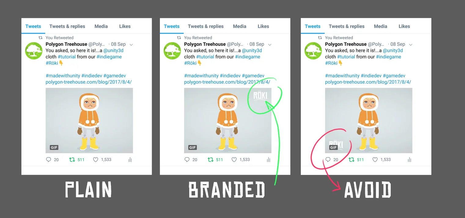
We add our #Röki logo to pretty much all our images. It means that, no matter where the image ends up, someone who sees it can easily track down more information about the game or at least tell where it came from. On a personal artistic level I like adding graphical logos to art, I think it creates a nice contrast, improves frequency of detail and...it just looks cool!
One important thing to note is to avoid positioning your branding on the lower left corner of your image/GIF. This area is used by the GIF tag, or in the case of a video the time-code, which will obstruct your logo (see example on the right below).
GIFS Resolution VS framerate VS compression
When trying to squeeze the most out of your GIF and keep it under Twitter's 15mb limit it's important to realise that resolution is not king. As mentioned before, it is unlikely that anyone will be be viewing your image outside of the feed so you don't actually need the resolution to be that great, certainly not 1080p (1920 x 1080) by any stretch of the imagination.
Also consider this, it is much more important to have a smooth frame rate and no visible compression artifacts. When trying to whittle your GIF down to below 15mb the first thing to take the knife to is the resolution. It is much better to drop down the resultion (that, to be frank no-one will notice) than to have a 'steppy' low frame rate (that will be very noticeable). Ditto for compression artifacts, you should be trying to keep compression on your GIFs to a minimum. Sure, sometimes GIF compression can give a certain grainy charm but only in modest quantities!
Our jumping-off point for resolution is 960 x 720 (for 4:3 aspect ratios) or 960 x 540 (for 16:9 aspect ratios). If file size starts to become an issue we have been known to go lower.
Of course, you need to author all you artwork at a higher resolution, it will be needed for other purposes, just not for Twitter.
Experiment
We've gleaned most of this from trying things out, having a play and trying some experiments. If something doesn't work the skies will not darken, your head won't suddenly pop-off your shoulders and make a dreadful mess of your sofa. Life will continue, so if you have an idea try it out!
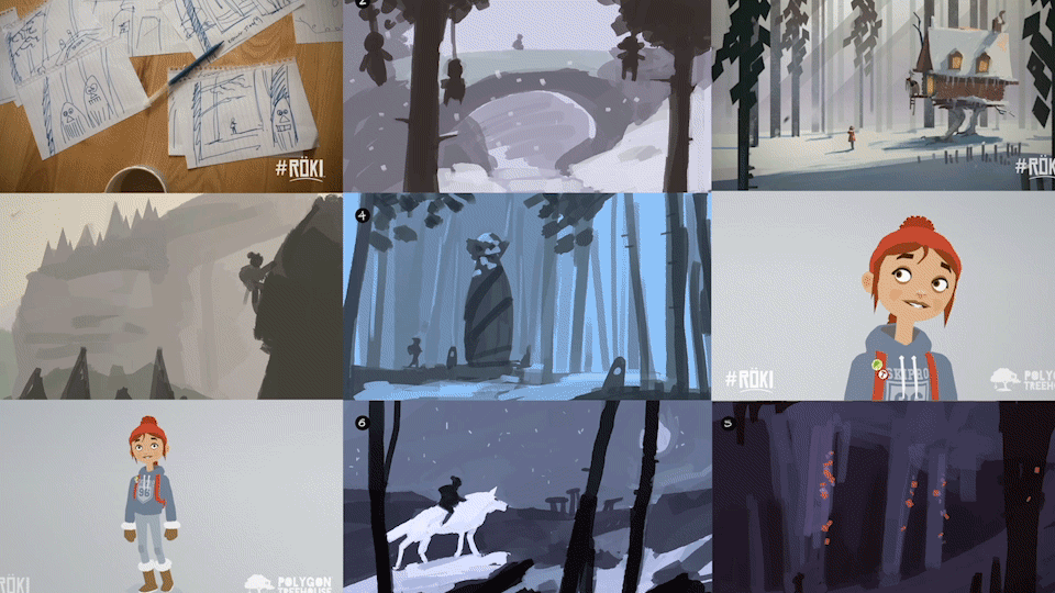
A good example of this is with our time-lapse concept art posts (example below). Rather than making the viewer sit through the whole video (a little bit of an ask when there are lots of other things vying for their attention) before seeing the time-lapse footagewe added a preview of the final art at the start of the video. We found adding this preview made a better first impression (rather than a blank page before the painting began) and made people more likely to watch the time-lapse.

That's your lot!
That's about it, hope that was an interesting read. To be honest when I started writing I wasn’t sure how much I'd have to bang on about, turns out there was a fair bit!
Until next time,
Alex & Tom