The Art Style of Röki – Part One
We've spoken previously about balancing the art production equation for a game (you can read the amazing details again here). Today, I'm going to dig into the specific aesthetic choices we've made and some of the techniques we will be leveraging for Röki.
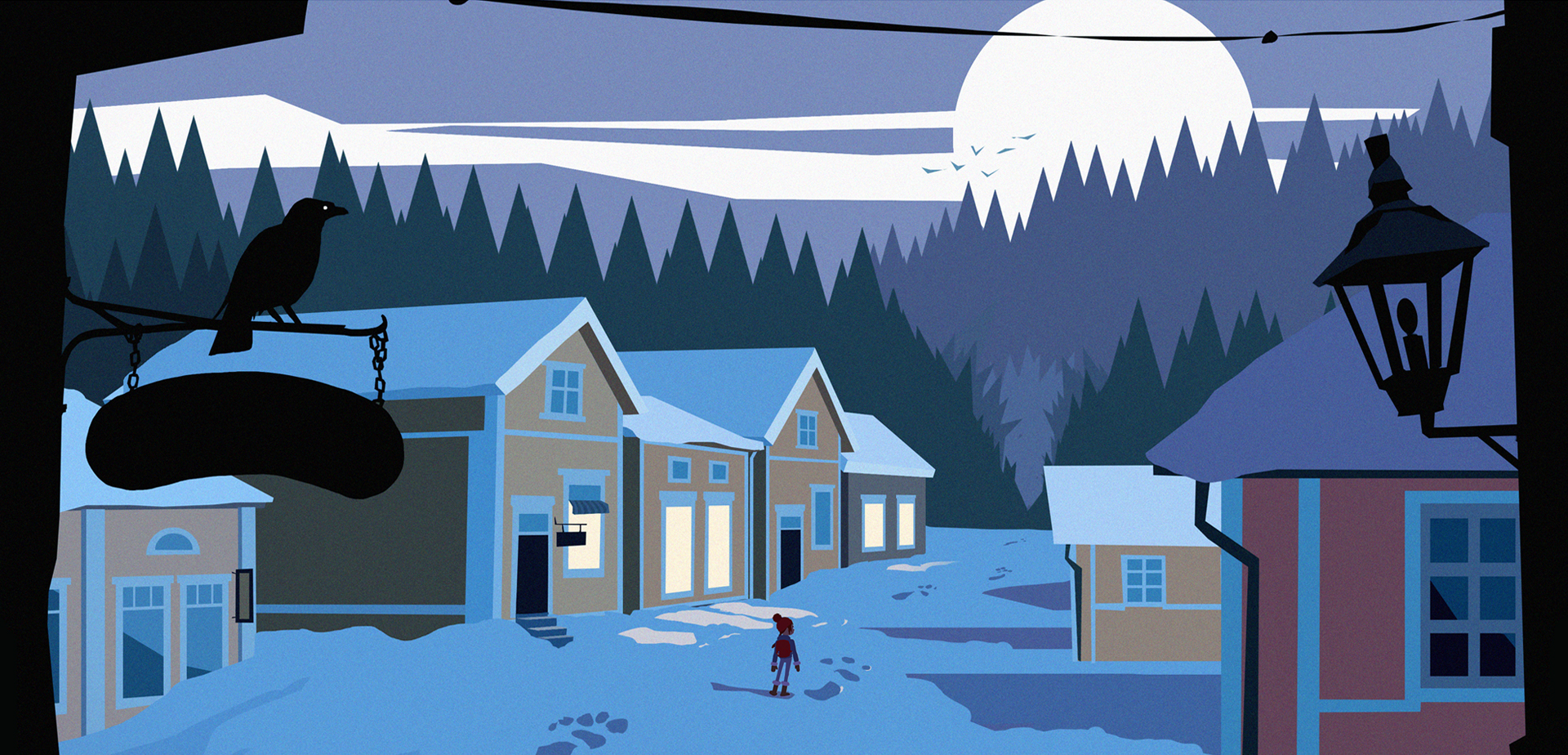
First things first, the game is built in 3D. Some people on initial viewing thought it was constructed in 2D,...it's not (I think this is down to the use of flat colours and illustrative style). This is not really important per se, but I thought it worth mentioning. 3D is where our strengths and experience lie so it was the obvious choice for us. It also give us more freedom to move around and allows us to be a bit more dynamic with the camera.
As you can see we use flat colours, some subtle gradients and a pinch of noise. As well as making everything look quite stylish and minimal it also scales very well. By that I mean it looks super crisp and crunchy on a large HDTV but also remains readable and not too fussy on a smaller tablet or mobile screen. It also has a couple of big time/efficiency wins:
- Very little texture work, we can concentrate on the pure use of colour.
- No time consuming UV layout work (not quite true but we'll get to that later)
- We can live with intersections and overlaps as they are masked by the flat colours
- No time spent on traditional 3D Lighting
Essentially the entire game is not lit in the traditional 3D sense. There are no lights or lighmaps to talk of, rather we light it with our choice of colours which is a pure creative choice that we can take directly from our 2D concepts. Knowing that what we see in Photoshop will translate directly to game means that we can work quickly and with confidence. In fact, we can take more than just our colour choices directly from Photoshop. We actually generate geometry from out 2D concepts, exported from Photoshop as Illustrator curves and then used in Maya LT to auto generate geometry - so again, a direct translation from concept to the game, pretty cool.

Now there is a question of how we light Tove, our main character. She, like the rest of the game world, is unlit and receives no lighting in the traditional 3D sense, she just uses flat colour values. If left simply like this she would look stuck on, out of place and struggle to bed into the scene and become believable part of the game world. Also, she wouldn't be affected by any objects around her as she moves through the world, like walking under a bridge for example. In short, if left unaddressed it would look like a big bag of guff.
But don't panic, we've got a nifty system of 'Unlit Lights™'. These Unlit Lights™ each have a tint colour and brightness multiplier so can tweak the brightness of the character's material depending on her proximity to each light. So we can 'light' the character on a scene by scene basis, or have the values dynamically interpolate with multiple Unlit Lights™ in a scene. It's pretty neat, give us great control and works a treat (we may do another post about the specifics of this system).
I said earlier that we had side-stepped time consuming UV layout work. This is true, but we still do one camera projection on the background for one simple reason, noise! In our early concept work we found that subtle noise on the background allowed the characters (who have no noise) to pop a little and stand out, attracting the viewer's attention. There is another plus to utilising noise on the background and that is gradients. Subtle gradients tend to compress badly and can band or look stepped (even when the textures are uncompressed there are only so many colours to go transition through) which is annoying as you want it to look super smooth. Using noise with gradients actually combats this and massively reduces any visible banding. So basically, double win!
Right that's enough for today. There are a number of other interesting art elements to come back to but I need a sandwich so they'll have to wait until next time ;)
Thanks for reading,
Alex & Tom.